From Rothko's Art to Fashion: Monochrome Pieces

Monochromatic pieces have been an important form of expression in many artistic mediums: whether it’s monochromatic painting, black and white photography or even architecture-- something about using neighboring colors on the color wheel has fascinated people for a long time. Abstract expressionism pioneer, Mark Rothko, created iconic monochrome works and so did Robert Rauschenberg, famous for his collages that use mixed media. My fascination with the idea links to my interest in curating outfits with subtle color variations; something about the symmetry always stands out and elevates the look. It also distracts the eye from focusing on the obvious — colors and patterns -- to more subtle aspects such as texture and silhouette, creating a more refined aesthetic. To explain my creative inspiration, and perhaps to inspire you to see fashion from a more artistic lens, here’s a tiny bit about some really cool monochromatic art pieces.
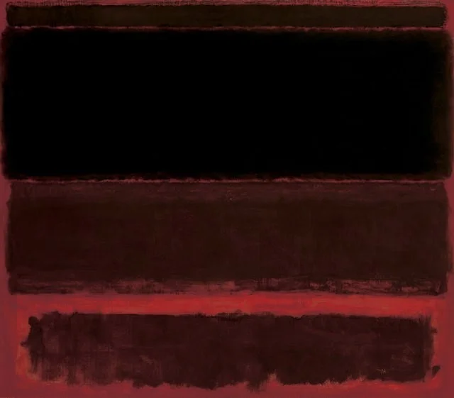
Black on Deep Red - Mark Rothko
Rothko wished for his viewers to directly communicate with the intense emotion and spirituality of his paintings. For me, the piece pictured above is highly unsettling: There’s something incomplete, unsettling and uneven about them that conveys turbulence and misery. The panels of colors are not equal, certain parts of the paint seem scratched off, and the bottom layers of paint show through, which contradicts a clean and complete piece one wants to see. The artwork’s colors seem gory too. It’s interesting to see how four panels of color, all so close together in shade, can convey so much without any palpable representation.

Untitled - Robert Rauschenberg

Untitled - Robert Rauschenberg
Robert Rauschenberg also uses of a uniform color or monochrome palette, but for an extremely different purpose. Instead of sticking to paint, he uses objects found in everyday life, ranging from newspaper cut outs to scraps of cloth, to inspire the viewer to focus on the different textures. This is similar to my aim with monochrome outfits - i want the eye to be focused on the silhouettes. He believes art and life are inseparable and uses this philosophy to shape how a viewer will interpret daily objects jarred in a different context in his paintings. He worked a lot with red to challenge himself.

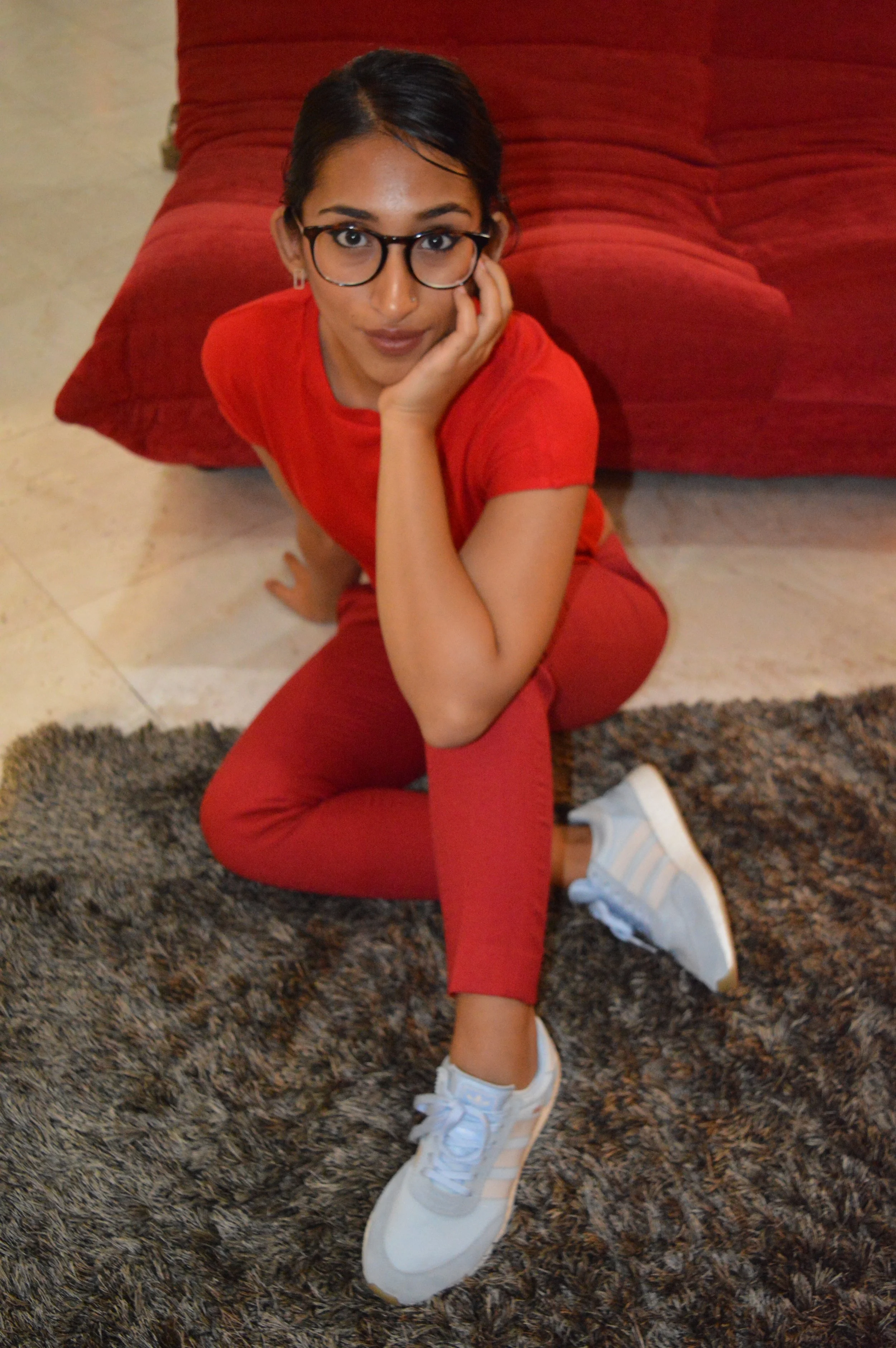
Just as artists use different textures and found materials, it’s important for me when styling monochrome colors to work with subtle variations of tone, textures and silhouettes. I personally find red to be a jarring, rich color – especially the deeper reds. At a point in my style when I want to challenge myself to combine non-minimalist and non-trendy pieces, I thought working with red-on-red, while combining street-wear and formal silhouettes would go a long way to convey a certain transitory and confused space. I find it important to experiment with different techniques to see how I react and can grow - I highly recommend it, even for simple things like learning which silhouettes better suit your body.